Finding the right color palette can feel like hunting for an elusive creature in the jungle. It is something that I have struggled with up until about four years ago. It was not because I’m good at picking colors. I struggle as much as everyone else when it comes to making design choices.
There are plenty of books and studies on color theory, but sometimes they can feel rigid and overly scientific. Picking colors should be something that is fun, or at the very least does not cause any extra stress.
I decided to work on a palette that I put together over the course of a couple of months. I knew that I wanted a bright and vibrant kid-friendly set of colors. My goal was to create a palette that I could use for most of my art so that it would create consistency and familiarity when someone views my art. The result of the basic palette is in the image of the Palette Feathered Peachick above. I also have a separate CMYK-influenced palette that can be seen in the jungle image. The two palettes do overlap pretty well and can be mixed together.
Color Resources
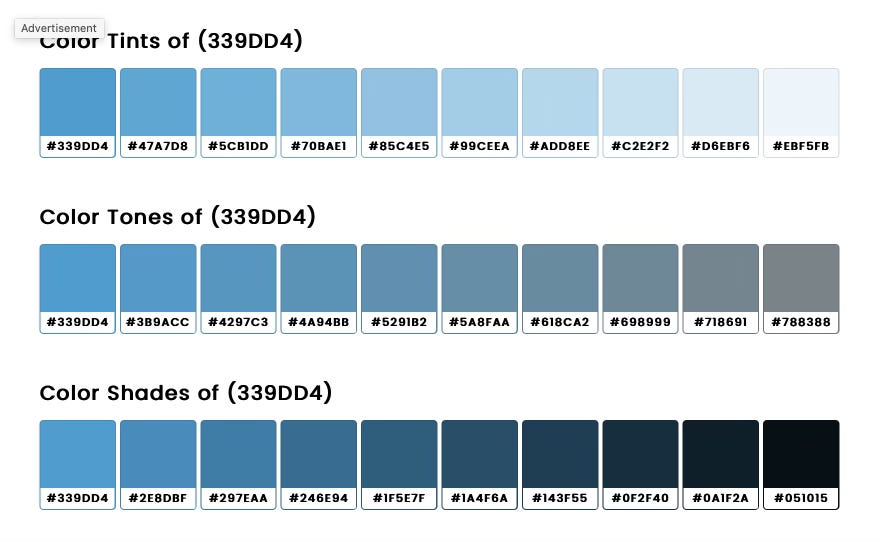
SchemeColor is a website that I use to look for interesting palettes. You can also click on individual colors in a palette to see tints and shades of that color.
There is a free iOS app called Swatches that will let you choose colors from either photos in your library or taking a photo of something. It lets you create a palette and provides a few options for sending the results to yourself.
For inspiration, there are two Instagram accounts that I follow for color inspiration.
Colours.cafe is an account that I have followed for many years now. They share color palettes often and hold contests from time to time. They share palettes that are conected to the seasons and holidays.
Colorpalette.cinema is a newer account that I started following. They take movies and television shows and explore the color palettes found in the world of cinema.
My best advice is to look at the artwork that you like and use a tool to create a color palette from the art. The next step is to try the palette in your art and see if it resonates with your style. Also, let your palette breathe and live. Add and subtract colors as needed to achieve your vision.
Have fun color hunting.
Be kind to yourself on your creative journey.
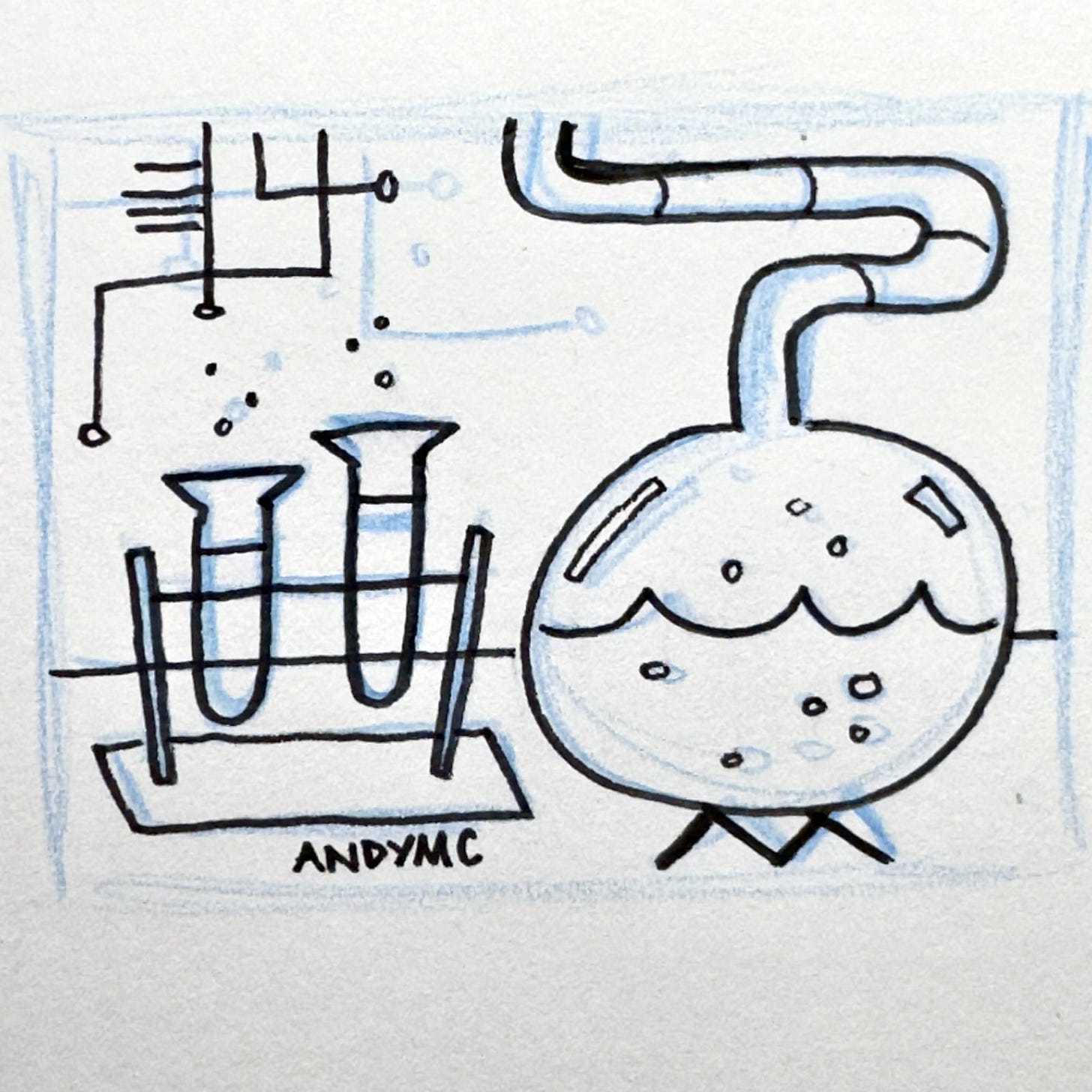
Here are the two sketchbook drawings for the illustrations.
Buy Me a Coffee
Thank you for reading my newsletter. The newsletter and illustrations take time and effort to create. You can support the newsletter and my illustrations by forwarding the newsletter to someone who would like it or by signing up for the paid version. Like ❤️ or leave a comment 💬 to help SubStack find and promote the newsletter.
You can also Buy T-Shirts, make a purchase in my digital shop, or give a one-time tip on Buy Me a Coffee.
Buy Me a Coffee (Ko-Fi.com) makes it easy to support the newsletter and my art. In just a couple of taps, you can make a contribution (buy me a coffee). It doesn't even require you to create an account.
You made it to the end of the newsletter. Here is a fun video and song about primary colors by the band OK Go on Sesame Street. 😊


Thanks for the palettes article. This can help me to and the right colors for my drawing. Would you like to discuss about the process of your drawing? From sketching until the end of products. Do you have any specific sketching/ drawing app? After the final drawing finished, do you need to retouch or edit it in photoshop?